BridgeCom
Showcase project
Modern platform for seamless collaboration
About company
BridgeCom is a communication platform that brings video calls, chat, and collaboration tools into one seamless experience. My goal was to design an intuitive, visually engaging, and easy-to-use interface that makes staying connected effortless. From structuring the app to refining the design system, I focused on creating a smooth and cohesive user experience.
The Challenge
I wanted to create a platform that brings people together through seamless collaboration and a modern, intuitive experience.
⚠️ Bringing everything together
The platform needed to seamlessly integrate video calls, chat, and collaboration tools while keeping the interface simple and easy to use.
⚠️ Bringing everything together
The platform needed to seamlessly integrate video calls, chat, and collaboration tools while keeping the interface simple and easy to use.
⚠️ Bringing everything together
The platform needed to seamlessly integrate video calls, chat, and collaboration tools while keeping the interface simple and easy to use.
⚠️ Balancing work and social interaction
Users needed a space that felt professional for meetings but also inviting for casual conversations and social interactions.
⚠️ Balancing work and social interaction
Users needed a space that felt professional for meetings but also inviting for casual conversations and social interactions.
⚠️ Balancing work and social interaction
Users needed a space that felt professional for meetings but also inviting for casual conversations and social interactions.
⚠️ Ensuring easy navigation
With multiple features and sections, it was crucial to create a clear and intuitive structure so users could find what they needed without effort.
⚠️ Ensuring easy navigation
With multiple features and sections, it was crucial to create a clear and intuitive structure so users could find what they needed without effort.
⚠️ Ensuring easy navigation
With multiple features and sections, it was crucial to create a clear and intuitive structure so users could find what they needed without effort.
⚠️ Creating a strong visual identity
The design had to feel modern, polished, and engaging, reinforcing BridgeCom’s identity while maintaining high usability.
⚠️ Creating a strong visual identity
The design had to feel modern, polished, and engaging, reinforcing BridgeCom’s identity while maintaining high usability.
⚠️ Creating a strong visual identity
The design had to feel modern, polished, and engaging, reinforcing BridgeCom’s identity while maintaining high usability.
My Role
I designed BridgeCom’s interface and user experience, making sure everything felt smooth, clear, and easy to use.
From organizing the platform’s features to fine-tuning the visuals, I focused on creating a design that’s both modern and intuitive. My goal was to make navigation effortless and interactions seamless while giving the platform a strong, polished look.
Design process
Every step, from research to testing, helped create a product that’s simple, intuitive, and easy to use. Here’s how I made it all come together:
Research & Insights
Before jumping into design, I explored competitors, studied user needs, and identified key challenges. This helped define the foundation for a product that truly fits its audience.
Competitor Analysis
Hypotheses
Research
Moodboard
Structure
I mapped out user journeys and created wireframes to make sure the platform was intuitive and easy to navigate. Every screen and interaction was carefully planned to create a seamless flow.
App Map
User Flow
Wireframe
UX Design
Testing
Visual Design
The interface was crafted to feel modern, engaging, and user-friendly. A structured design system ensured consistency across the platform, making it visually appealing and functional.
Design System
UI Design
Design Testing
UX Design
Ready to launch
After the design handoff, the project is now in the development and testing phases. We're actively gathering feedback during this stage to further refine and enhance the application, making sure it delivers the best user experience possible.
Development Stage
Performance Testing
User Feedback
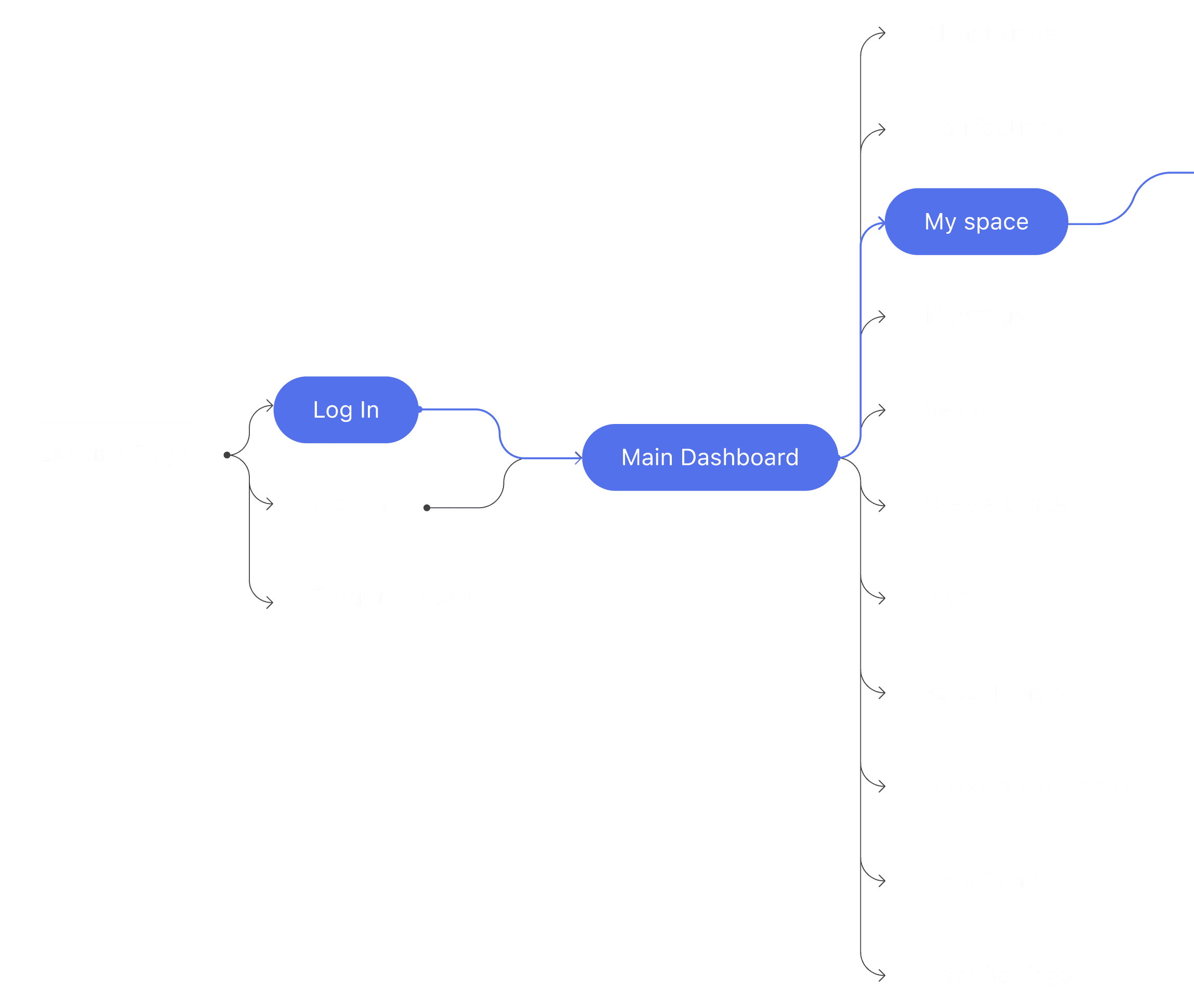
App structure
I mapped out the app’s layout to show how everything connects—making sure navigation feels smooth and intuitive.
Pain Points
Users needed a single platform to streamline all their communication tools in one place.
The goal was to create a platform that effortlessly combines communication, collaboration, and usability. From structuring the interface to refining the visual identity, every design decision was focused on making interactions smooth, intuitive, and engaging.
🔗
Hypothesis: Users need a single platform that integrates messaging, calls, and collaboration tools in a seamless way.
Strategy: Create a connected ecosystem where users can easily switch between work-related tasks and casual interactions without losing context.
Design solution: Designed an intuitive, all-in-one platform that allows users to communicate and collaborate effortlessly, reducing the need to jump between different tools.
⚖️
Hypothesis: The checkout process had too many steps, unclear progress indicators, and confusing payment options, leading to a high cart abandonment rate.
Strategy: Develop an interface that feels structured for work but also allows for casual interactions, keeping engagement natural.
Design solution: Built a flexible layout with clear separation between professional and social spaces, ensuring smooth transitions between different modes of communication.
🤝
Hypothesis: With so many features, users need a clear way to navigate without getting overwhelmed.
Strategy: Simplify the platform’s structure, making it intuitive for both new and experienced users to find what they need quickly.
Design solution: Created a logical and well-organized navigation system with clear labels, smart grouping, and smooth transitions to keep the experience effortless.
🎨
Hypothesis: A consistent and polished design helps build trust and makes the platform feel reliable.
Establish a modern, user-friendly aesthetic that aligns with the brand’s identity while maintaining high usability.
Developed a cohesive design system with clear typography, structured layouts, and engaging visuals to enhance clarity and create a professional look.
Hypothesis
Strategy
Design Solution
🔗
Users need a single platform that integrates messaging, calls, and collaboration tools in
a seamless way.
Create a connected ecosystem where users can easily switch between work-related tasks and casual interactions without losing context.
Designed an intuitive, all-in-one platform that allows users to communicate and collaborate effortlessly, reducing the need to jump between different tools.
⚖️
People want a space that adapts to both professional and social communication needs.
The checkout process had too many steps, unclear progress indicators, and confusing payment options, leading to
a high cart abandonment rate.
Develop an interface that feels structured for work but also allows for casual interactions, keeping engagement natural.
Built a flexible layout with clear separation between professional and social spaces, ensuring smooth transitions between different modes of communication.
Built a flexible layout with clear separation between professional and social spaces, ensuring smooth transitions between different modes of communication.
🤝
With so many features, users need a clear way to navigate without getting overwhelmed.
Simplify the platform’s structure, making it intuitive for both new and experienced users to find what they need quickly.
Simplify the platform’s structure, making it intuitive for both new and experienced users to find what they need quickly.
Created a logical and well-organized navigation system with clear labels, smart grouping, and smooth transitions to keep the experience effortless.
Created a logical and well-organized navigation system with clear labels, smart grouping, and smooth transitions to keep the experience effortless.
🎨
A consistent and polished design helps build trust and makes the platform feel reliable.
Establish a modern, user-friendly aesthetic that aligns with the brand’s identity while maintaining high usability.
Developed a cohesive design system with clear typography, structured layouts, and engaging visuals to enhance clarity and create a professional look.
UI & Visuals
Showcasing modern pages and user-friendly navigation
I focused on crafting a visually engaging and user-friendly experience that truly reflects the brand’s identity.
By refining page structures, enhancing readability, and simplifying navigation, I ensured visitors could effortlessly explore the portfolio and connect with the studio. The design balances aesthetics with usability, creating an inviting and polished online presence.
In the following sections, I’ll walk you through key design choices that enhance usability and highlight the studio’s expertise, providing a closer look at how each element contributes to a seamless user journey.
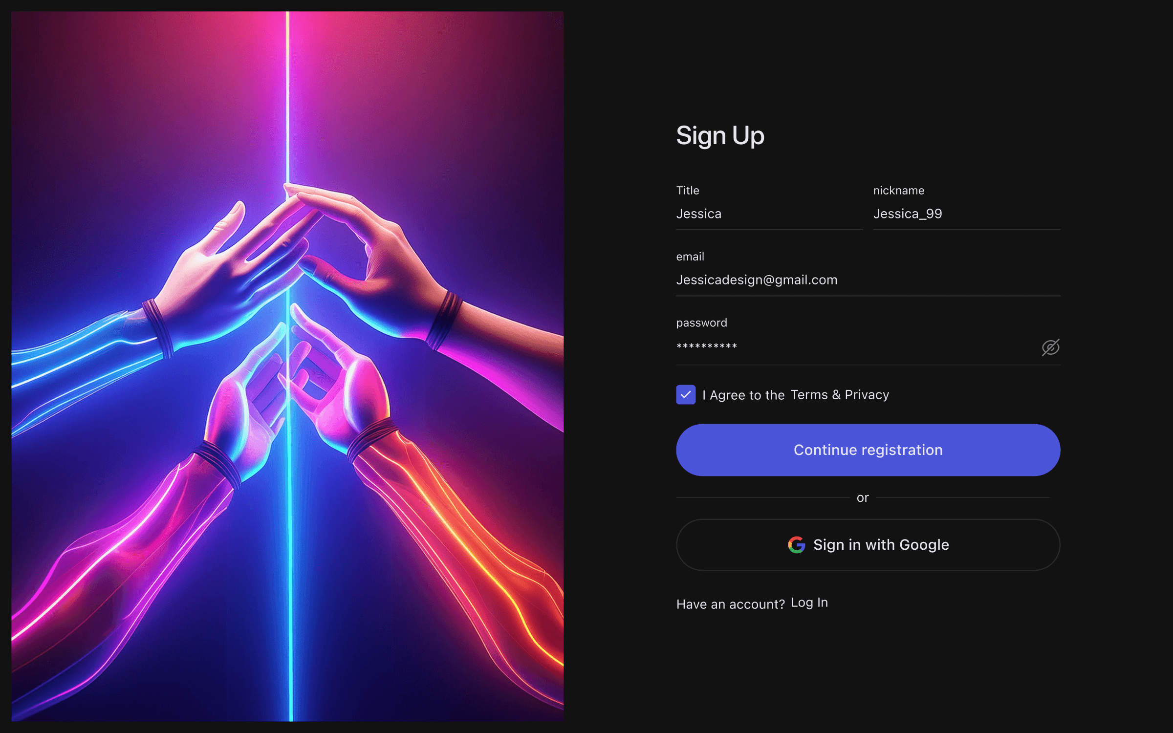
A Quick and Easy Start
Sign up in seconds
Joining should be easy, and that’s exactly how we designed it. The registration process is fast, clear, and secure. With just a few steps, you’re in—no hassle, no confusion, just a smooth experience from the start.
A Quick and Easy Start
Sign up in seconds
Joining should be easy, and that’s exactly how we designed it. The registration process is fast, clear, and secure. With just a few steps, you’re in—no hassle, no confusion, just a smooth experience from the start.
A Quick and Easy Start
Sign up in seconds
Joining should be easy, and that’s exactly how we designed it. The registration process is fast, clear, and secure. With just a few steps, you’re in—no hassle, no confusion, just a smooth experience from the start.
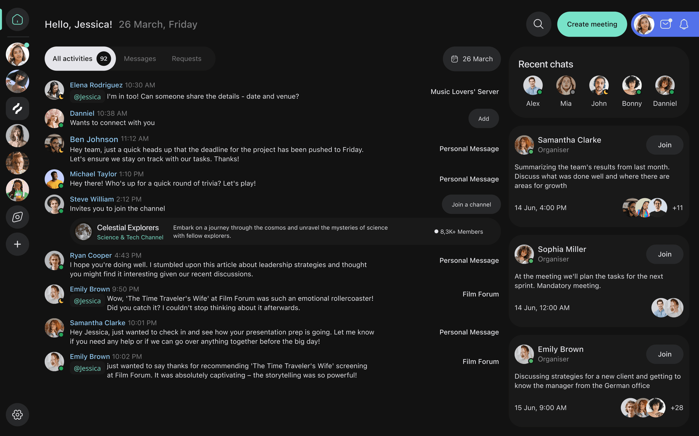
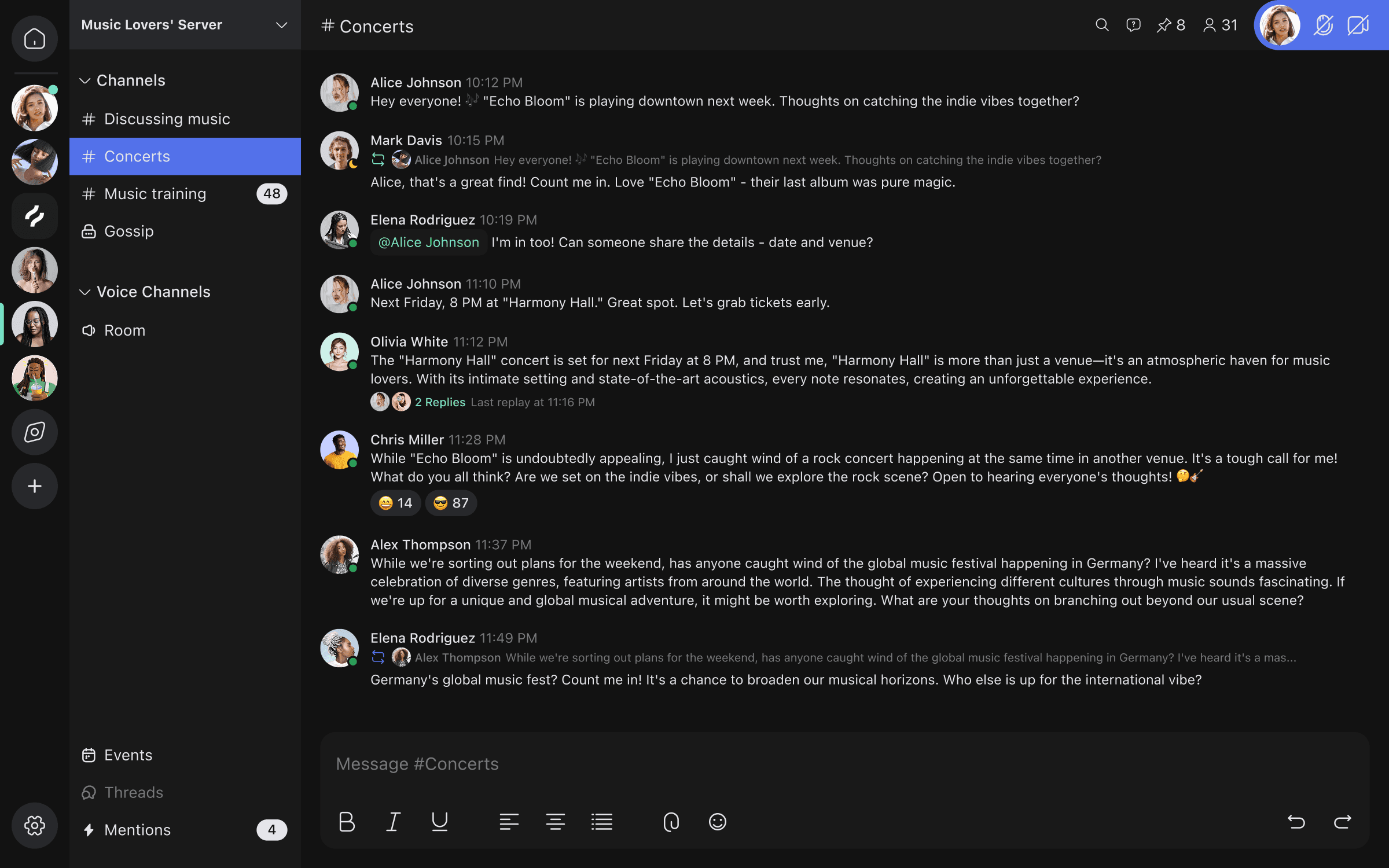
Stay on Top of Everything
All your updates in one spot
No need to switch between different windows and apps—get all your notifications, mentions, and messages in a single, clear view. This streamlined layout makes it easy to follow up on important conversations without missing anything.
Stay on Top of Everything
All your updates in one spot
No need to switch between different windows and apps—get all your notifications, mentions, and messages in a single, clear view. This streamlined layout makes it easy to follow up on important conversations without missing anything.
Stay on Top of Everything
All your updates in one spot
No need to switch between different windows and apps—get all your notifications, mentions, and messages in a single, clear view. This streamlined layout makes it easy to follow up on important conversations without missing anything.
Your Space, Your Rules
Stay organized and in control
A space built just for you. Keep track of important messages, mentions, and updates—all in one place. Whether you’re managing work discussions or catching up with friends, everything is structured so you can switch between different conversations effortlessly. Customize it the way you like and stay on top of what matters most.
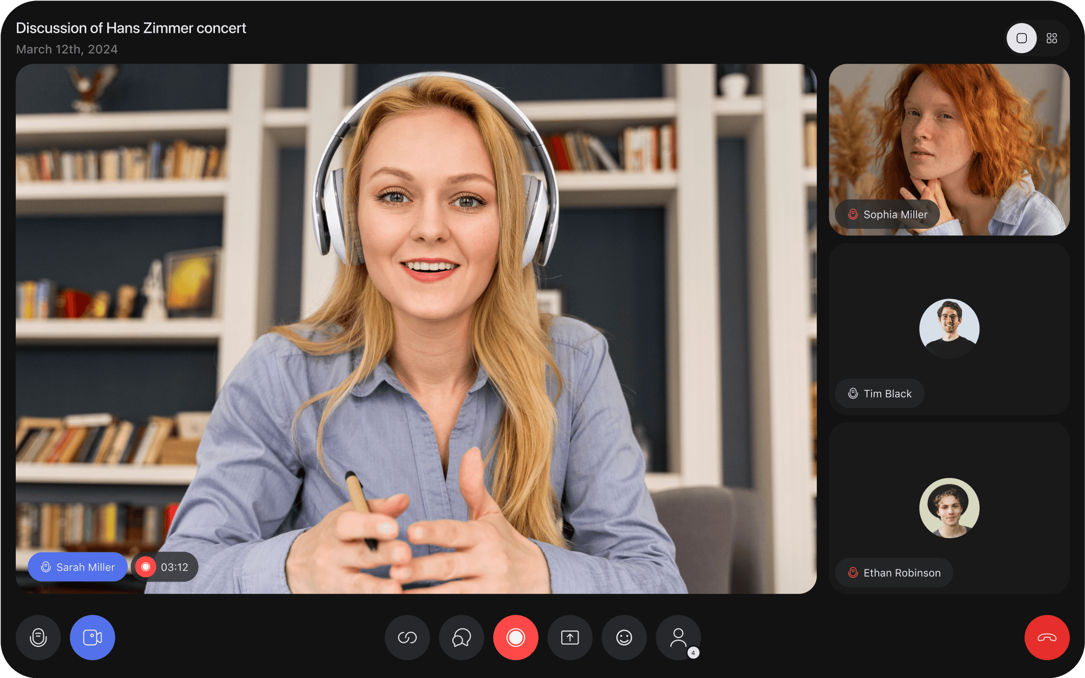
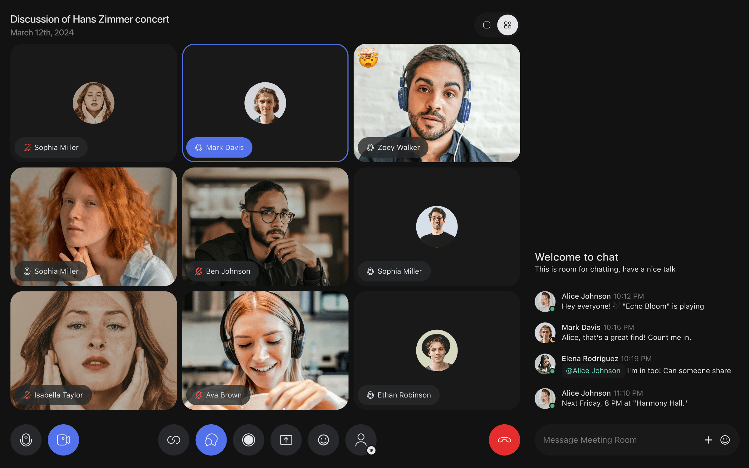
Effortless Video Calls
Simple, smooth, and stress-free
High-quality video calls that just work. No complicated settings, no distractions—just a clean, intuitive interface designed for natural conversations. Whether it’s a team meeting, a brainstorming session, or a casual chat, everything is optimized to keep the focus on what matters.
Find Your Community
Easily explore and join channels
Looking for a space where you truly belong? The discovery page makes it simple. Browse categories, check out trending channels, and dive into conversations that match your interests. Whether it’s work, hobbies, or casual chats, you can easily find and join the right communities.

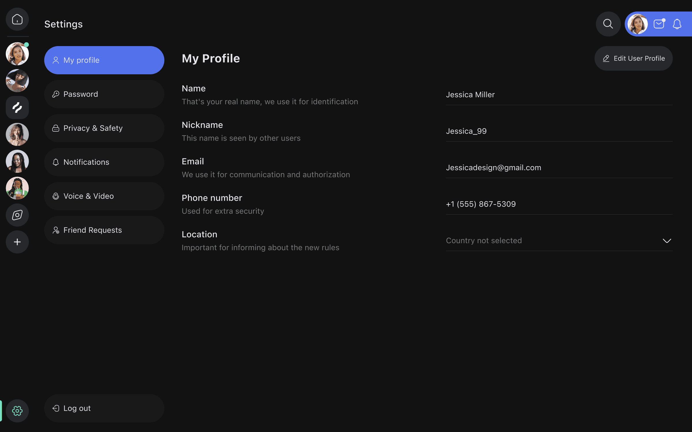
Make It Your Own
Customize settings to fit your needs
Your account, your rules. Easily adjust privacy settings, notifications, and preferences—all in one simple, well-organized menu. Everything is designed to be intuitive, so you can find and tweak what you need without any effort.
Make It Your Own
Customize settings to fit your needs
Your account, your rules. Easily adjust privacy settings, notifications, and preferences—all in one simple, well-organized menu. Everything is designed to be intuitive, so you can find and tweak what you need without any effort.
Make It Your Own
Customize settings to fit your needs
Your account, your rules. Easily adjust privacy settings, notifications, and preferences—all in one simple, well-organized menu. Everything is designed to be intuitive, so you can find and tweak what you need without any effort.
Takeaway
What I learned from this project
Working on BridgeCom was all about making communication simple and seamless. The challenge was to bring different tools—chat, calls, and collaboration—into one space without making it feel overwhelming. I focused on creating a clean, easy-to-navigate interface that feels familiar while keeping all the essential features within reach. This project reinforced how important it is to balance functionality with simplicity. A platform should be powerful but never complicated. It also reminded me that great design isn’t just about how things look—it’s about making sure people can use them effortlessly. Seeing it all come together in Framer was a rewarding experience, and I’m excited to keep refining digital experiences that feel natural and intuitive.
Product Design
UX/UI Strategy
Design Systems
Got an exciting project in mind?
I am always open to new opportunities, interesting projects, or professional networking. Get in touch, and let’s build something great together.
Got an exciting project in mind?
I am always open to new opportunities, interesting projects, or professional networking. Get in touch, and let’s build something great together.
Got an exciting project in mind?
I am always open to new opportunities, interesting projects, or professional networking. Get in touch, and let’s build something great together.