*Due to NDA restrictions, It’s a placeholder name.
A Premium Shopping Experience for Cat Lovers
About company
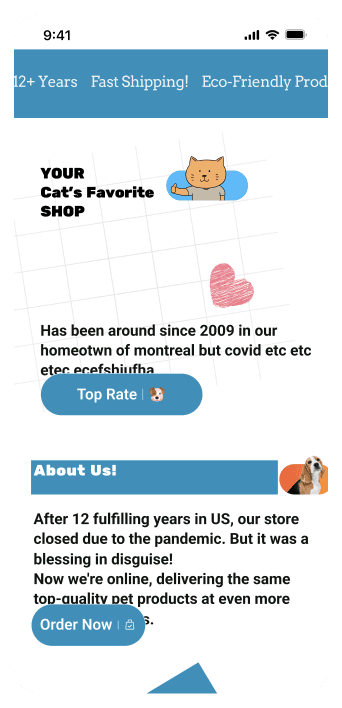
Paws & Play is a U.S.-based e-commerce store specializing in premium cat products. The brand is all about providing high-quality, stylish, and functional pet supplies for cat owners who want the best for their furry companions.
About company
Paws & Play is a U.S.-based e-commerce store specializing in premium cat products. The brand is all about providing high-quality, stylish, and functional pet supplies for cat owners who want the best for their furry companions.
About company
Paws & Play is a U.S.-based e-commerce store specializing in premium cat products. The brand is all about providing high-quality, stylish, and functional pet supplies for cat owners who want the best for their furry companions.
The Challenge
In 2024, it became clear that the store needed a redesign. The previous version wasn’t fully capturing the brand’s playful charm or effectively converting visitors into customers.
⚠️ Low mobile conversion rates
Most visitors were shopping from their phones, but the outdated design made navigation frustrating. Slow load times, cluttered layouts, and small touch targets created friction, leading to high drop-off rates before checkout.
⚠️ Low mobile conversion rates
Most visitors were shopping from their phones, but the outdated design made navigation frustrating. Slow load times, cluttered layouts, and small touch targets created friction, leading to high drop-off rates before checkout.
⚠️ Low mobile conversion rates
Most visitors were shopping from their phones, but the outdated design made navigation frustrating. Slow load times, cluttered layouts, and small touch targets created friction, leading to high drop-off rates before checkout.
⚠️ Difficult product discovery
Finding the right products wasn’t as smooth as it should be. The navigation was unintuitive, filters were limited, and the search functionality didn’t always return relevant results. As a result, users struggled to browse efficiently and abandoned their search.
⚠️ Difficult product discovery
Finding the right products wasn’t as smooth as it should be. The navigation was unintuitive, filters were limited, and the search functionality didn’t always return relevant results. As a result, users struggled to browse efficiently and abandoned their search.
⚠️ Difficult product discovery
Finding the right products wasn’t as smooth as it should be. The navigation was unintuitive, filters were limited, and the search functionality didn’t always return relevant results. As a result, users struggled to browse efficiently and abandoned their search.
⚠️ Checkout friction
The checkout process had too many steps, unnecessary form fields, and a confusing flow that caused frustration. Many users abandoned their carts before completing their purchase, leading to lost sales and a lower overall conversion rate.
⚠️ Checkout friction
The checkout process had too many steps, unnecessary form fields, and a confusing flow that caused frustration. Many users abandoned their carts before completing their purchase, leading to lost sales and a lower overall conversion rate.
⚠️ Checkout friction
The checkout process had too many steps, unnecessary form fields, and a confusing flow that caused frustration. Many users abandoned their carts before completing their purchase, leading to lost sales and a lower overall conversion rate.
My Role
Led the end-to-end redesign
to improve mobile usability and drive conversions
Led the end-to-end redesign to improve mobile usability and drive conversions
I focused on creating a mobile-first experience, refining navigation, optimizing product discovery, and streamlining the checkout process. By simplifying the user journey and aligning the design with the brand’s identity, we transformed the store into a seamless, engaging shopping experience.
Pain Points
The old experience made shopping harder than it should be
Before the redesign, the site wasn’t as easy or enjoyable to use as it could be. Mobile users struggled with clunky navigation, finding the right products took too many steps, and the checkout process was frustrating enough to make people give up. It was clear that a smoother, more intuitive shopping experience was needed—one that made buying premium cat products as effortless as possible.
🔍
Hypothesis: Most users shopped from their phones, but the site wasn’t built for it. Buttons were small, navigation felt clunky, and it was hard to find products.
Strategy: Prioritize a mobile-first experience by improving navigation, reorganizing categories, and ensuring seamless browsing and product discovery.
Design solution: I changed the entire layout, making navigation more intuitive, increasing button sizes, refining filters so users could find products effortlessly.
🛒
Hypothesis: The checkout process had too many steps, unclear progress indicators, and confusing payment options, leading to a high cart abandonment rate.
Strategy: Simplify the checkout flow by reducing unnecessary steps, making progress clear, and streamlining payment options.
Design solution: I designed a faster checkout flow with fewer fields and a clear progress bar, reducing friction and making purchases effortless.
🎁
Hypothesis: Customers weren’t noticing promotions, and many discounts went unnoticed, reducing conversion rates.
Strategy: Make offers and discounts more visible by placing them strategically and adding elements like timers and highlight banners.
Design solution: Promotions are now highlighted with banners, countdown timers, and discount labels, making deals impossible to miss.
🎨
Hypothesis: The website didn’t fully reflect the brand’s fun and pet-friendly identity, which affected engagement and emotional connection with users.
Strategy: Align the design with the brand’s playful personality by using a warm color palette, engaging typography, and pet-focused imagery.
Design solution: I refreshed the visual identity, using rounded elements, pet-themed icons, and a vibrant yet clean design that feels fun and inviting.
Hypothesis
Strategy
Design Solution
🔍
Most users shopped from their phones, but the site wasn’t built for it. Buttons were small, navigation felt clunky, and it was hard to find products.
Prioritize a mobile-first experience by improving navigation, reorganizing categories, and ensuring seamless browsing and product discovery.
I changed the entire layout, making navigation more intuitive, increasing button sizes, refining filters so users could find products effortlessly.
🛒
The checkout process had too many steps, unclear progress indicators, and confusing payment options, leading to a high cart abandonment rate.
The checkout process had too many steps, unclear progress indicators, and confusing payment options, leading to
a high cart abandonment rate.
Simplify the checkout flow by reducing unnecessary steps, making progress clear, and streamlining payment options.
I designed a faster checkout flow with fewer fields and a clear progress bar, reducing friction and making purchases effortless.
I designed a faster checkout flow with fewer fields and a clear progress bar, reducing friction and making purchases effortless.
🎁
Customers weren’t noticing promotions, and many discounts went unnoticed, reducing conversion rates.
Make offers and discounts more visible by placing them strategically and adding elements like timers and highlight banners.
Make offers and discounts more visible by placing them strategically and adding elements like timers and highlight banners.
Promotions are now highlighted with banners, countdown timers, and discount labels, making deals impossible to miss.
Promotions are now highlighted with banners, countdown timers, and discount labels, making deals impossible to miss.
🎨
The website didn’t fully reflect the brand’s fun and pet-friendly identity, which affected engagement and emotional connection with users.
Align the design with the brand’s playful personality by using a warm color palette, engaging typography, and pet-focused imagery.
I refreshed the visual identity, using rounded elements, pet-themed icons, and a vibrant yet clean design that feels fun and inviting.
What happens when you blend user needs, brand personality, and smart design? A shopping experience that feels natural, fun, and effortless. Here’s how we transformed the journey
AS - IS
AS - IS
TO - BE
TO - BE
AS - IS
AS - IS
TO - BE
TO - BE
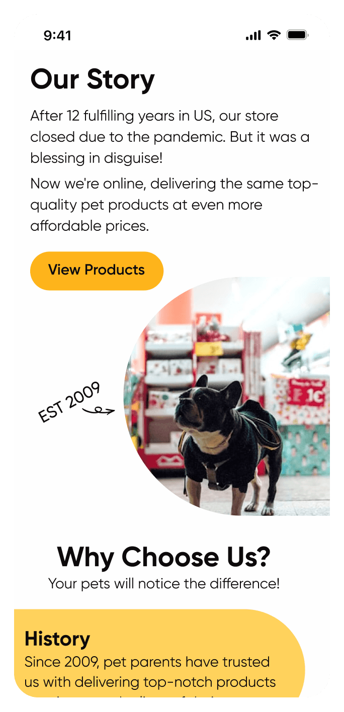
UI & Visuals
Showcasing redesigned product pages and intuitive navigation
I focused on creating a visually appealing and intuitive shopping experience. By refining product page layouts, enhancing visual hierarchy, and improving navigation, I ensured users could easily find and purchase products. The design reflects the brand’s playful identity while making the shopping process both engaging and seamless.
In the following sections, I’ll walk you through the specific examples of these improvements and provide a closer look at how they contribute to the overall user experience.
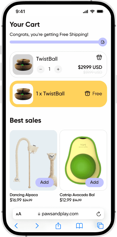
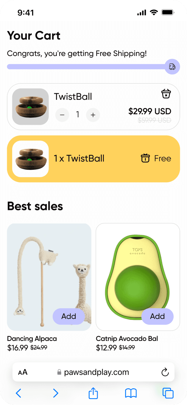
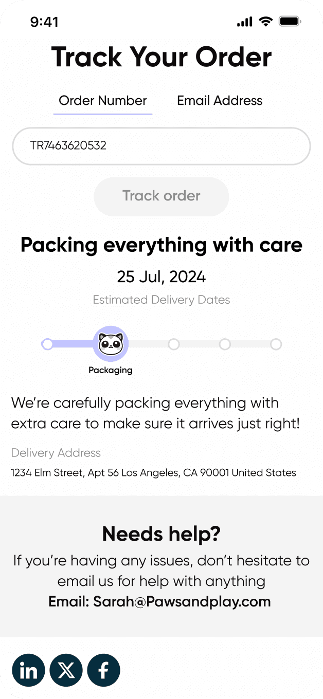
Seamless Shopping Experience
I focused on simplifying the shopping journey for users by making it as easy and intuitive as possible
The goal was to create a smooth and effortless shopping process. Customers can easily find products, add them to their cart, and check out without any unnecessary steps. We also introduced order tracking, so customers can follow their purchases in real time, ensuring a hassle-free experience from start to finish.
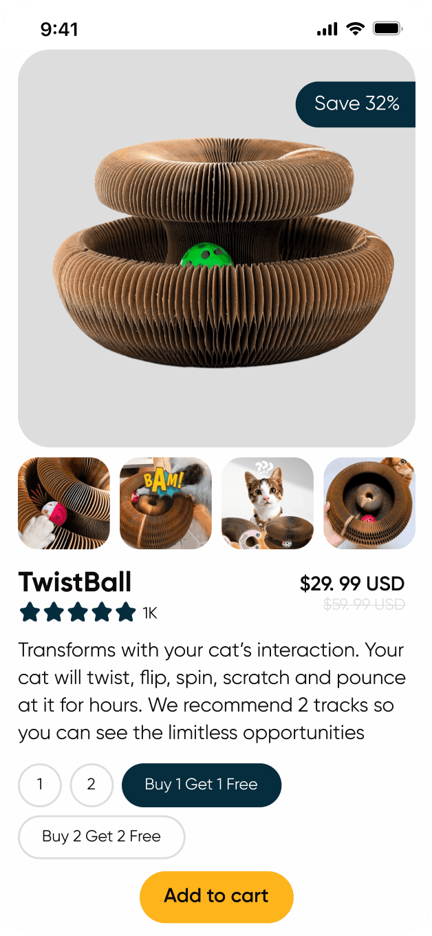
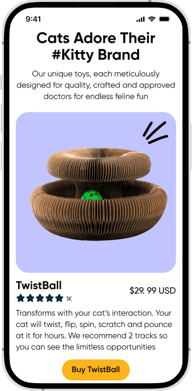
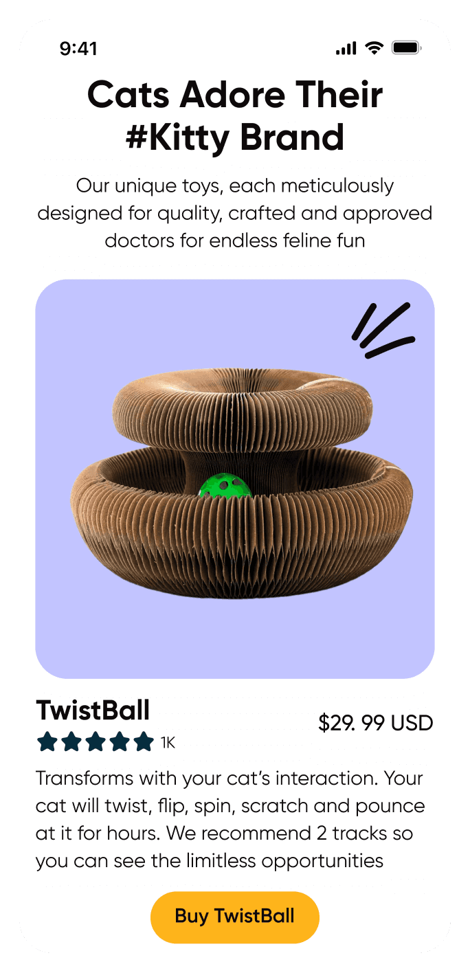
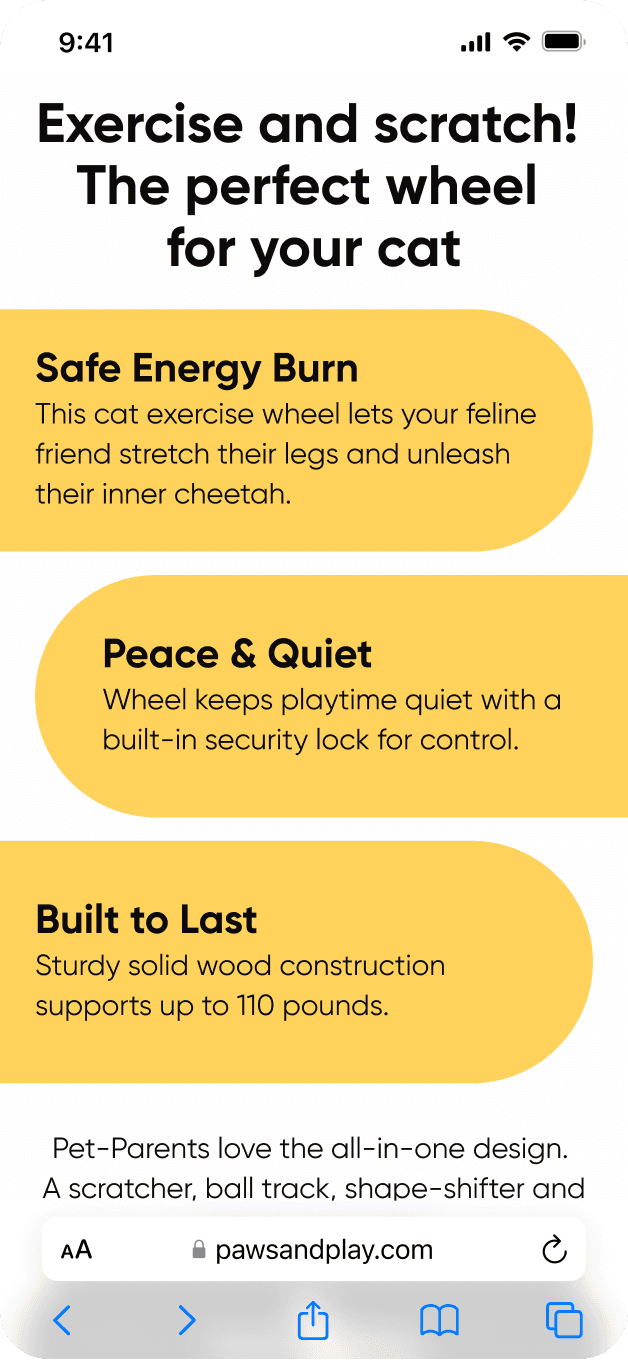
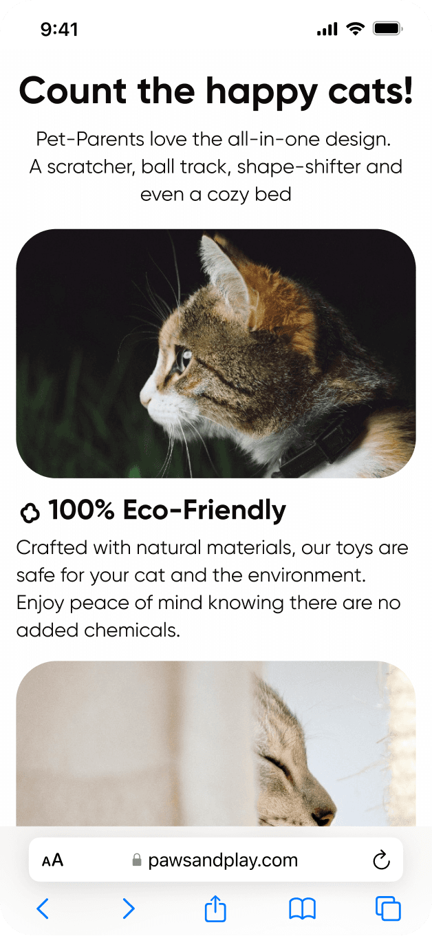
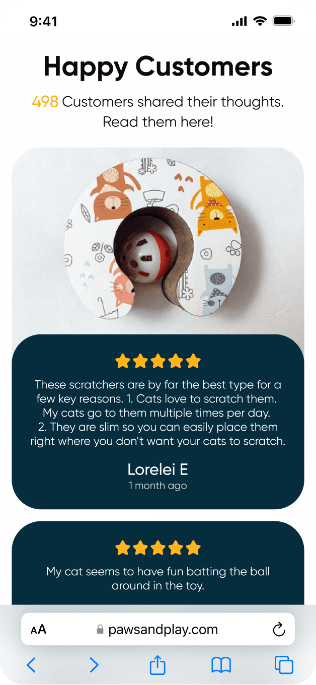
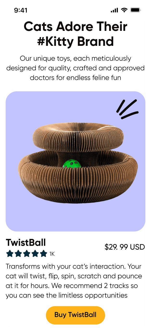
Building Trust with Product Details and Reviews
I made sure every product page provided enough information to help users make informed decisions
Each product is displayed with clear descriptions and high-quality images. I also added customer reviews and ratings, allowing future buyers to read feedback from others who’ve already purchased the product. This builds trust and reassures them that they’re making the right choice.
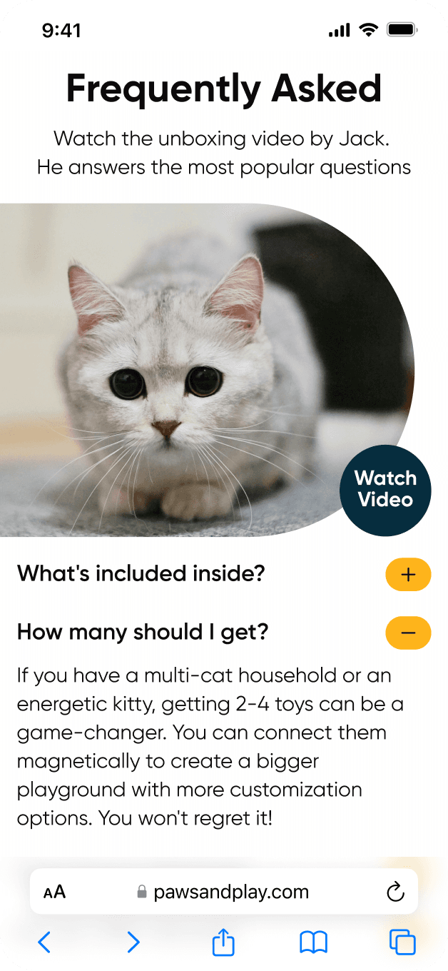
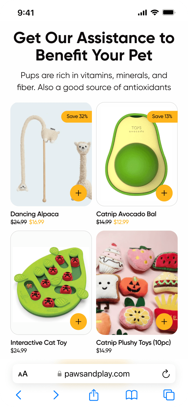
Answering Questions and Offering More
I included a section that answers the most common questions and recommends additional products
A detailed FAQ section helps users find answers to their concerns about the product. I also added related items that might interest them, improving the chances of additional sales while keeping the shopping experience personalized and customer-focused.
Answering Questions and Offering More
I included a section that answers the most commonquestions and recommends additional products
A detailed FAQ section helps users find answers to their concerns about the product. I also added related items that might interest them, improving the chances of additional sales while keeping the shopping experience personalized and customer-focused.
Answering Questions and Offering More
I included a section that answers the most common questions and recommends additional products
A detailed FAQ section helps users find answers to their concerns about the product. I also added related items that might interest them, improving the chances of additional sales while keeping the shopping experience personalized and customer-focused.
Testimonial
Dinara is a good designer not because she does whatever you say but because she takes her time to understand your needs and wants and gives the best solution to a problem. We enjoy working with her because we are pretty bad designers so it's nice to work with a designer that just takes charge of the project and can lead the project on her own with very little input.
Most of the time, you just want to tell designers "I don't know. Just make it look good" and that doesn't work but Everytime we do with that Dinara, we get great results.
Ronald M.
Takeaway
A thoughtful mobile-first redesign made shopping easier, boosted conversions by 60%, and helped drive over 115,000 orders in 6 months.
By focusing on intuitive navigation, a seamless checkout, and a more engaging brand experience, I helped transform the e-commerce store into a user-friendly platform that customers love. Alongside the redesign, we created a series of email campaigns that nurtured customer relationships, increased engagement, and significantly contributed to sales growth. The improved design and targeted emails worked together to create a smoother shopping journey and drive long-term success.
Takeaway
I included a section that answers the most commonquestions and recommends additional products
By focusing on intuitive navigation, a seamless checkout, and a more engaging brand experience, I helped transform the e-commerce store into a user-friendly platform that customers love. Alongside the redesign, we created a series of email campaigns that nurtured customer relationships, increased engagement, and significantly contributed to sales growth. The improved design and targeted emails worked together to create a smoother shopping journey and drive long-term success.
Takeaway
I included a section that answers the most common questions and recommends additional products
By focusing on intuitive navigation, a seamless checkout, and a more engaging brand experience, I helped transform the e-commerce store into a user-friendly platform that customers love. Alongside the redesign, we created a series of email campaigns that nurtured customer relationships, increased engagement, and significantly contributed to sales growth. The improved design and targeted emails worked together to create a smoother shopping journey and drive long-term success.
Product Design
Mobile UX
Redesign
Got an exciting project in mind?
I am always open to new opportunities, interesting projects, or professional networking. Get in touch, and let’s build something great together.
Got an exciting project in mind?
I am always open to new opportunities, interesting projects, or professional networking. Get in touch, and let’s build something great together.
Got an exciting project in mind?
I am always open to new opportunities, interesting projects, or professional networking. Get in touch, and let’s build something great together.